
Training Log
Training Log
DATE
September, 2016
ROLE
Ideation, Interaction, UI Design, Prototyping
TEAM
Design - 2
Engineering - 6
Product - 1
PLATFORM
iOS & Android
Visualizing An Athletes Training On Strava
The training and analyzing tools offered on the web and mobile platform have been an important component to user engagement and retention at Strava. It is also closely tied to our Summit membership offering, which is Strava's main source of revenue.
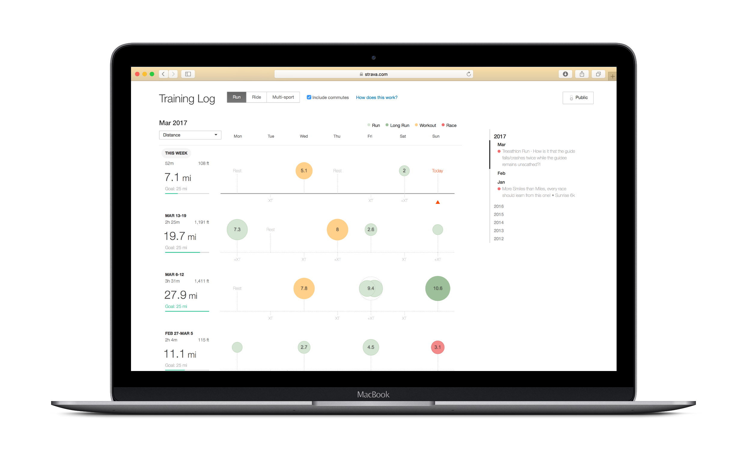
A training log is one of the most basic tools for an athlete when it comes to improving their performance. It gives them a way of documenting progress and recognizing patterns that inform what to do next in their training. Strava's web log was built in 2013 and has since become one of the most popular sections of our product (3rd behind the feed and activity details). We have seen increased usage over the past year and a steady stream of user requests to improve and expand it.
One of the key attributes of the log was that it allowed users to move through their entire training history on Strava. This was something that the mobile platform lacked, which meant that athletes would need to keep using the website to gain insight into their training patterns. Bringing the training log to the Strava mobile app would not only fill in this gap, but create a central place where athletes could go to analyze and plan their training.

IOS navigation

Android navigation
Representing Volume
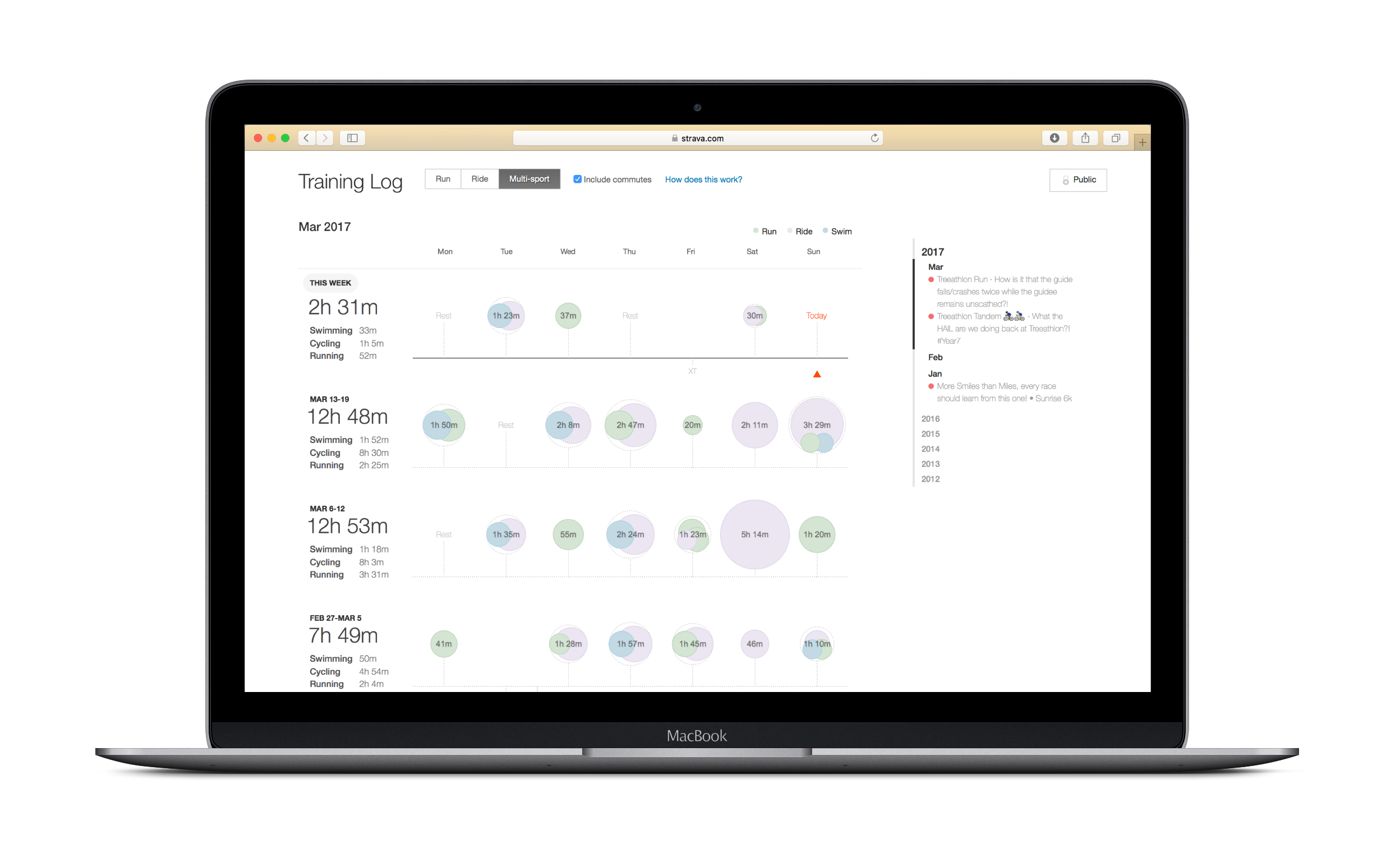
Maintaining a consistent experience with the web log played a role in the initial direction with rendering volume data. Attributes such as color and clustering behavior were carried over from the website with some slight tweaks to the rendering to give it a more tactile feel. Through user interviews, we found that displaying days with multiple activities or days with significant volume were more important to athletes than comparing day to day volume. They tended to use the log to quickly scan for patterns in workouts and larger activities. This helped guide our decision to move forward with the "bubble" visualization rather than change it across all platforms.

Volume scaling
Once we got a functional build running, we started testing it internally and externally. One of the first patterns that we were noticing was that the volume the athletes were seeing felt small and that they didn't think they were the right audience for the feature. A closer look revealed the logic used from the web log was brought was rendering the bubbles on the mobile client much smaller than anticipated.

With the help of our analytics team, we broke down distance, elevation, and time percentiles of our athletes activities. Those percentiles were then mapped current scaling logic, which revealed that 90% of all uploaded activities were only being scaled 25% of its maximum size. This system was heavily bias toward elite athletes and needed to change. Our team created a revised scaling method that used a logarithmic curve to increase the contrast of scaling within the highest percentile range.


Prototyping
This project relied heavily on prototypes to communicate the various states of interaction. We used Invision to user test flows and Principle when we moved to higher fidelity designs and interactions.

Additional States
In addition to redlines and specs, I created a board in Invision with more detail on the different views and states of the training log.


