
Relative Effort
Relative Effort
DATE
January - March, 2018
ROLE
Ideation, Interaction, UI design, Prototyping
TEAM
Design - 2, Engineering - 5
Product - 1, Marketing - 4
PLATFORM
iOS & Android
Introduction
The Summit Team is responsible for Strava’s subscription platform as well as developing new features and services offered under that platform. In an effort to increase retention and new subscriptions, we set out to better understand what our athletes care about most in their training. We started by looking at an annual survey that we send out mid-year to help us get a better sense of how athlete’s training preferences change through time. This year we found a strong trend toward tracking training progress through time. Digging into our own data a bit further, we found that our highest retaining feature on the platform–called Fitness & Freshness–was one of the only places where one could see a view of historic fitness trends on Strava.

Strava’s Fitness graph was one of the only places to track meaningful progress for an athlete. It was also one of the most complex features the company offered.
The problem was that Fitness & Freshness existed only on Strava’s web platform and we were seeing an increasing number of our athlete base move away from the web and use our mobile app exclusively. Fitness & Freshness was also seen as a highly complex feature with a steep learning curve to understand.
To better understand the problem we interviewed 16 athletes about their goals, training habits, and how they track their progress.
We found that a majority of athletes on Strava have a goal they are working towards. That goal can vary greatly from completing their first half marathon to being fit enough to be able to keep up with their friends, to qualifying for Boston. The connecting theme was that they all wanted a way to see the hard work they were putting in and how they were trending toward their goal.
“How might we help athletes track their progress in a meaningful way?”
Goals
Accessible anywhere – While most of our advanced training features were built and live exclusively on the web, a majority of our paid subscribers are coming from our mobile platforms. We wanted to ensure a product that was well suited for the mobile experience first before expanding it to the web.
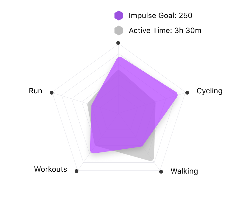
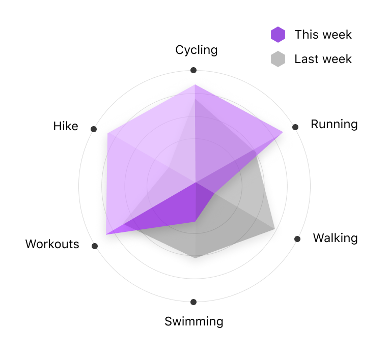
Measurable across their activities – Our data showed that nearly half of all active uploaders do multiple types of activities. This product needed to be measurable across different sport types.
Adds value regardless of their goals – Through extensive research on why athletes decide to use a platform such as Strava, we recognized that not all athletes come to win a KOM or be first on the leaderboard. Much or their motivations are centered around self improvement and maintaining an active lifestyle.
Explorations
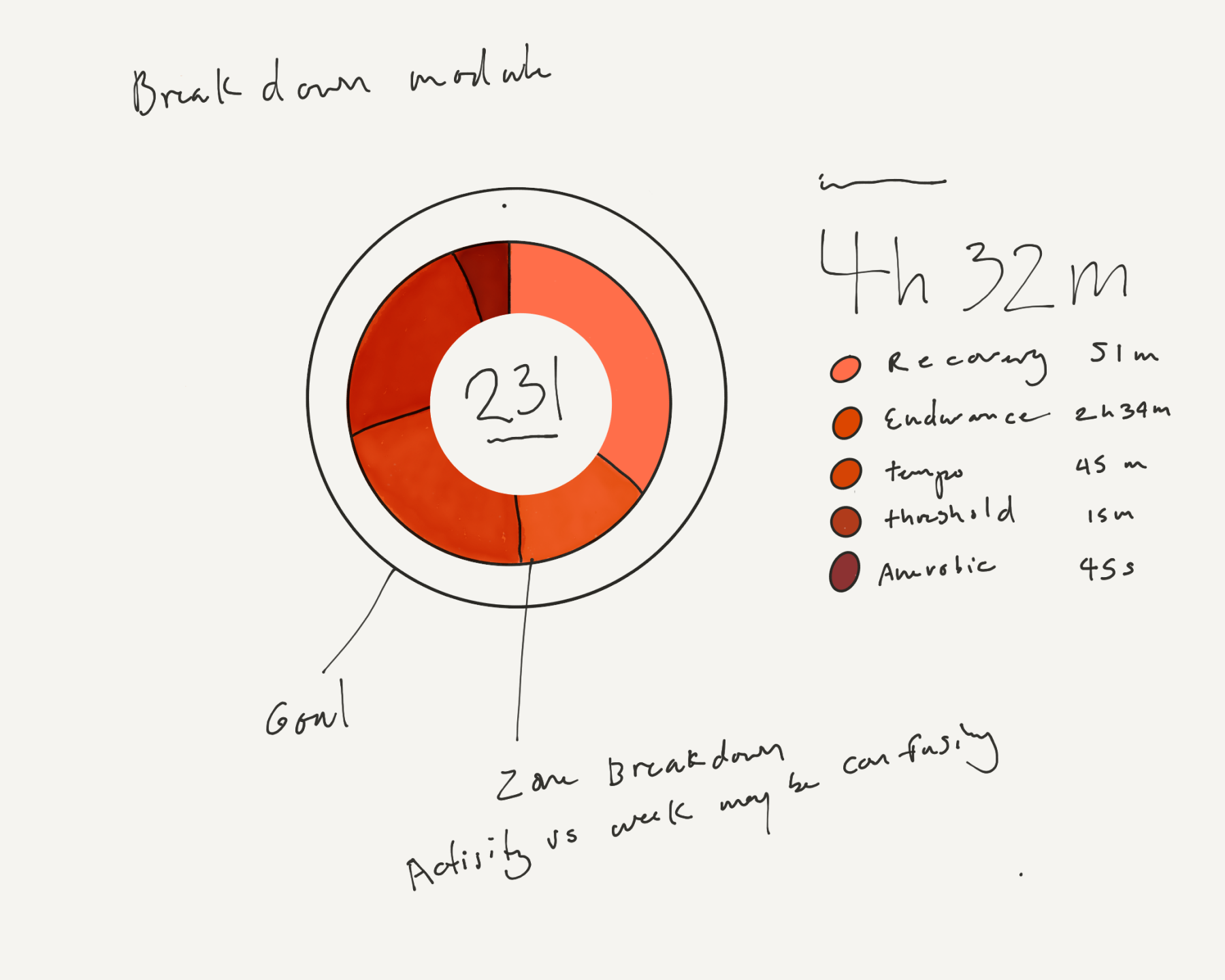
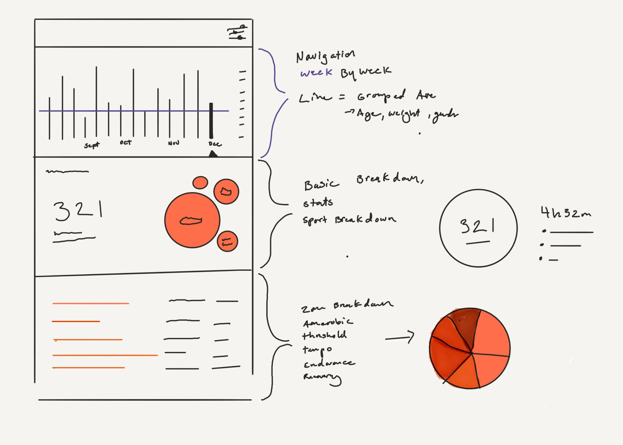
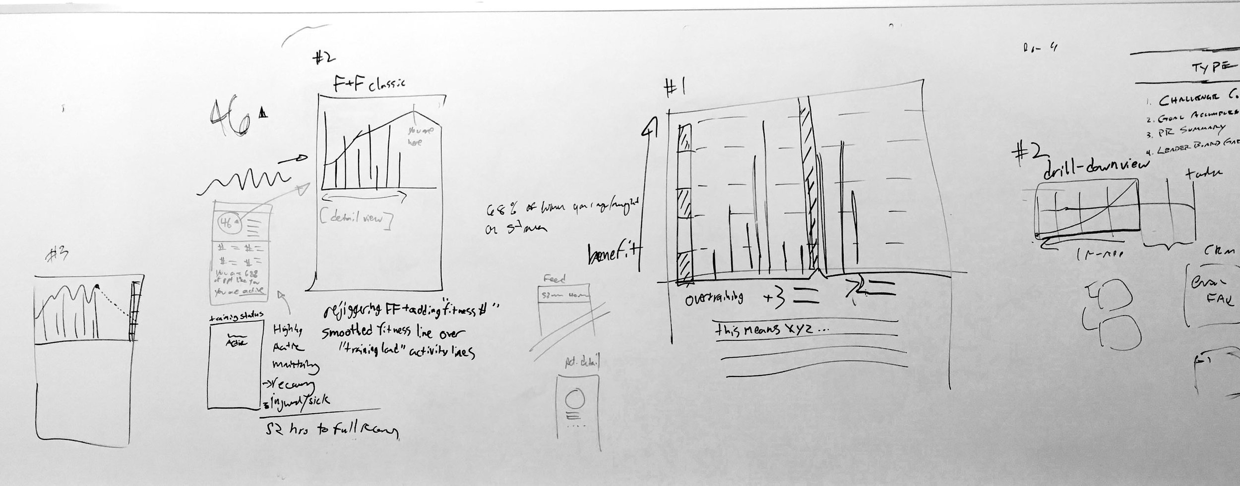
Through a number of personal and group sketching sessions, I started to explored different directions for visualizing an athletes progress. These explorations were focused around how to show cumulative volume over time and to clearly defined zones to help create a mental model for reading that volume.


Color
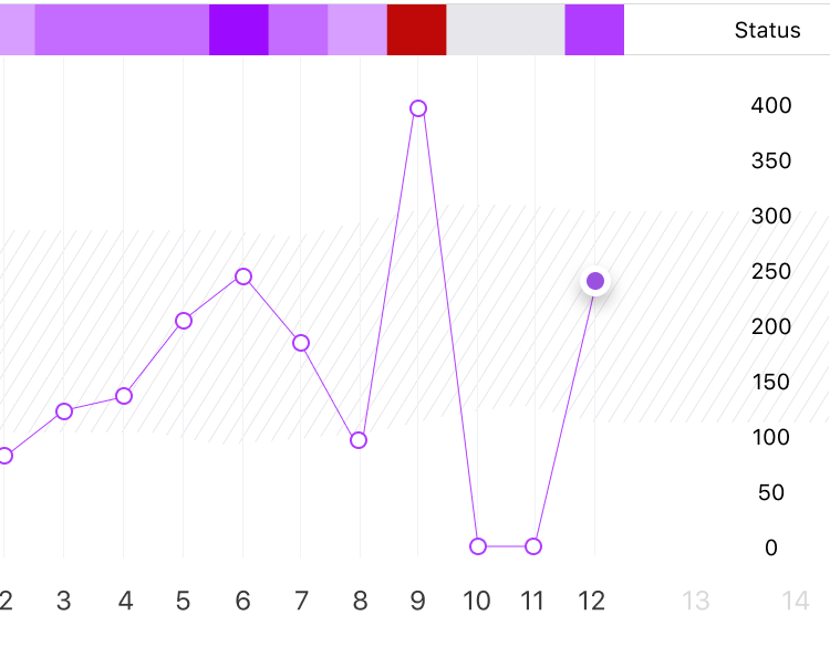
Strava already had a color system for displaying heart rate, power, and speed data. We explored how each could be broken into various levels of intensity. Through our testing, we found that sticking to a single hue did not offer enough obvious contrast to easily differentiate the different levels. We decided on a multi-hue progression and simplified the steps into 3 main intensity levels.

An exploration of different color systems.
Personalized insights
Through a combination of internal and external user tests, we had learned that our athletes had a very low tolerance for reading graphs and visualizations. Most of them had a difficult time understanding what the data meant and how they should be using it. This drove us to prioritize the “coach’s insight” of the data, being very careful with not filling the screen with heavy data visuals.
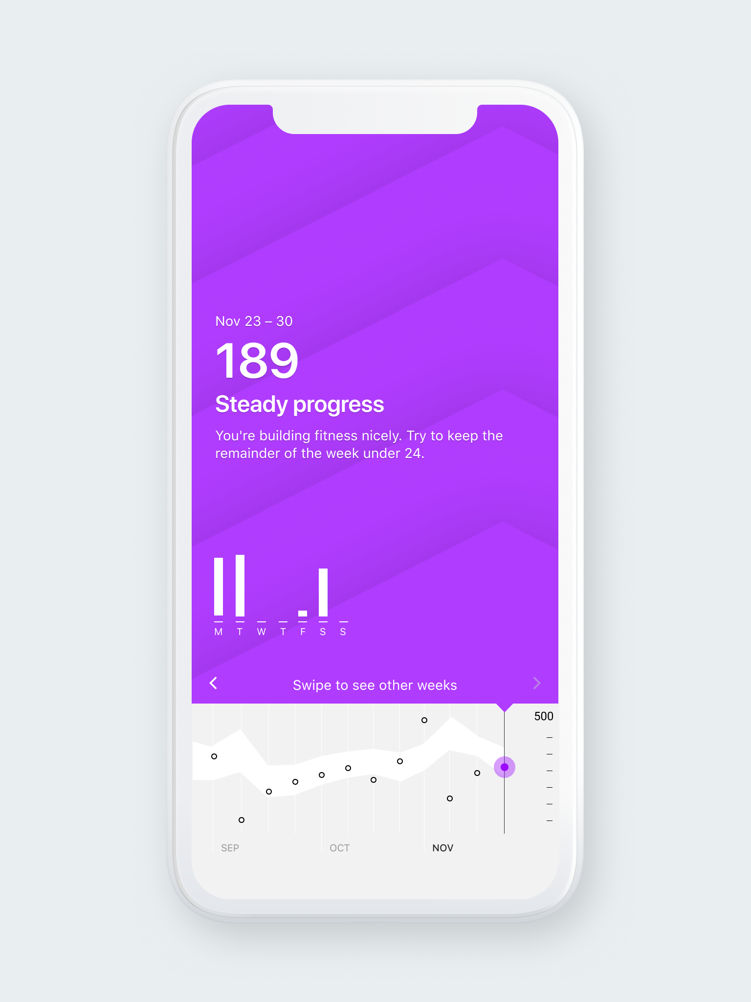
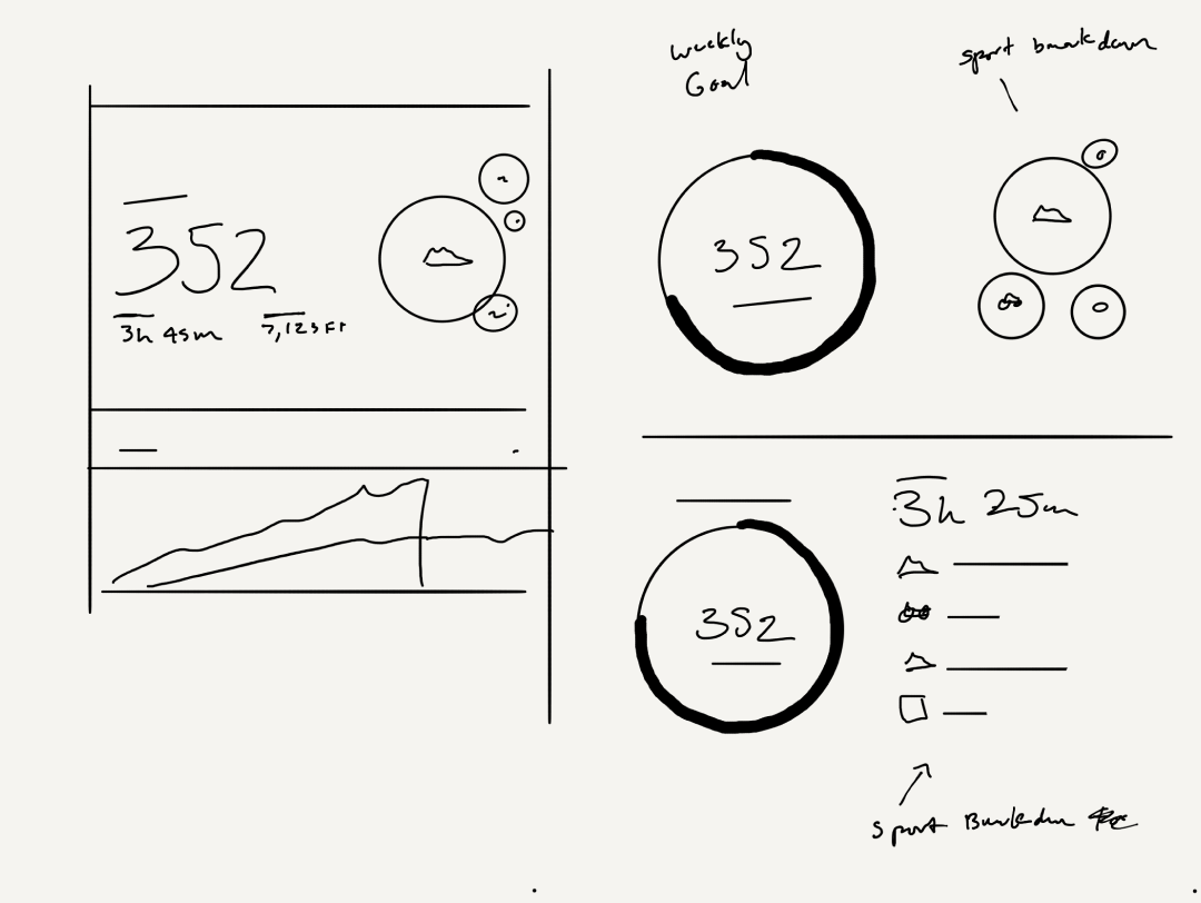
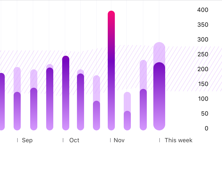
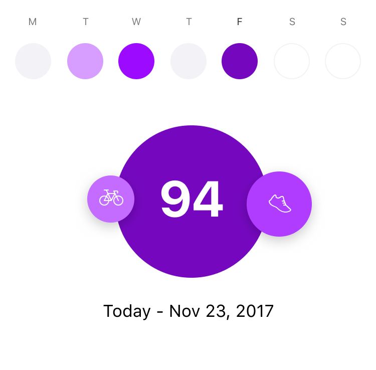
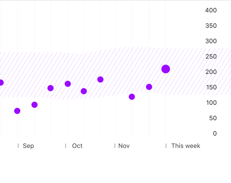
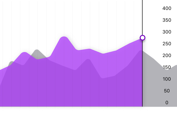
The flow consisted of an entry point module located in the activity detail screen. This was accessed after an athlete would upload their activity on Strava. Here they would see their effort score along side an explanation of how they should interpret that score. The graph below helped to give additional context. Tapping into the module will take them to the detail view where they would see a week-by-week summary of their cumulative effort. Here, they would be able to manage their weekly training plans according to how much stress they had accumulated through previous weeks.
We chose to display the data in context of the athletes personal activity history. This ensured that when their score was rated as high, medium, or low, it was compared to their personal capabilities and not Strava as a whole.


